Places for People
‘People first’ visual identity.
Problem
As part of our brand and technology transformation we wanted to increasing customer satisfaction, improve service quality, increase our social impact on communities, and maximise the efficiency and effectiveness of budget allocation. In order to communicate to colleagues and customers our People First aspirations, and what it means for them, we developed a new visual language to support the initiatives (which included a customer charter) with the aim of increasing engagement across a wide range of touch-points.
Solution
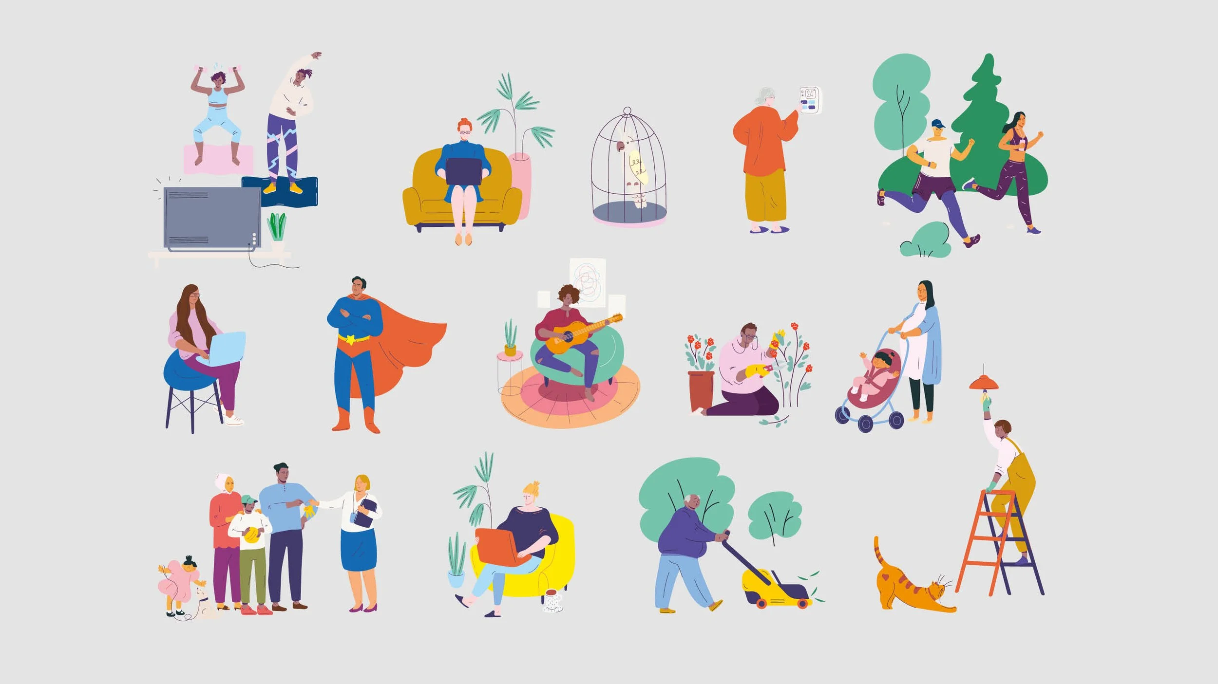
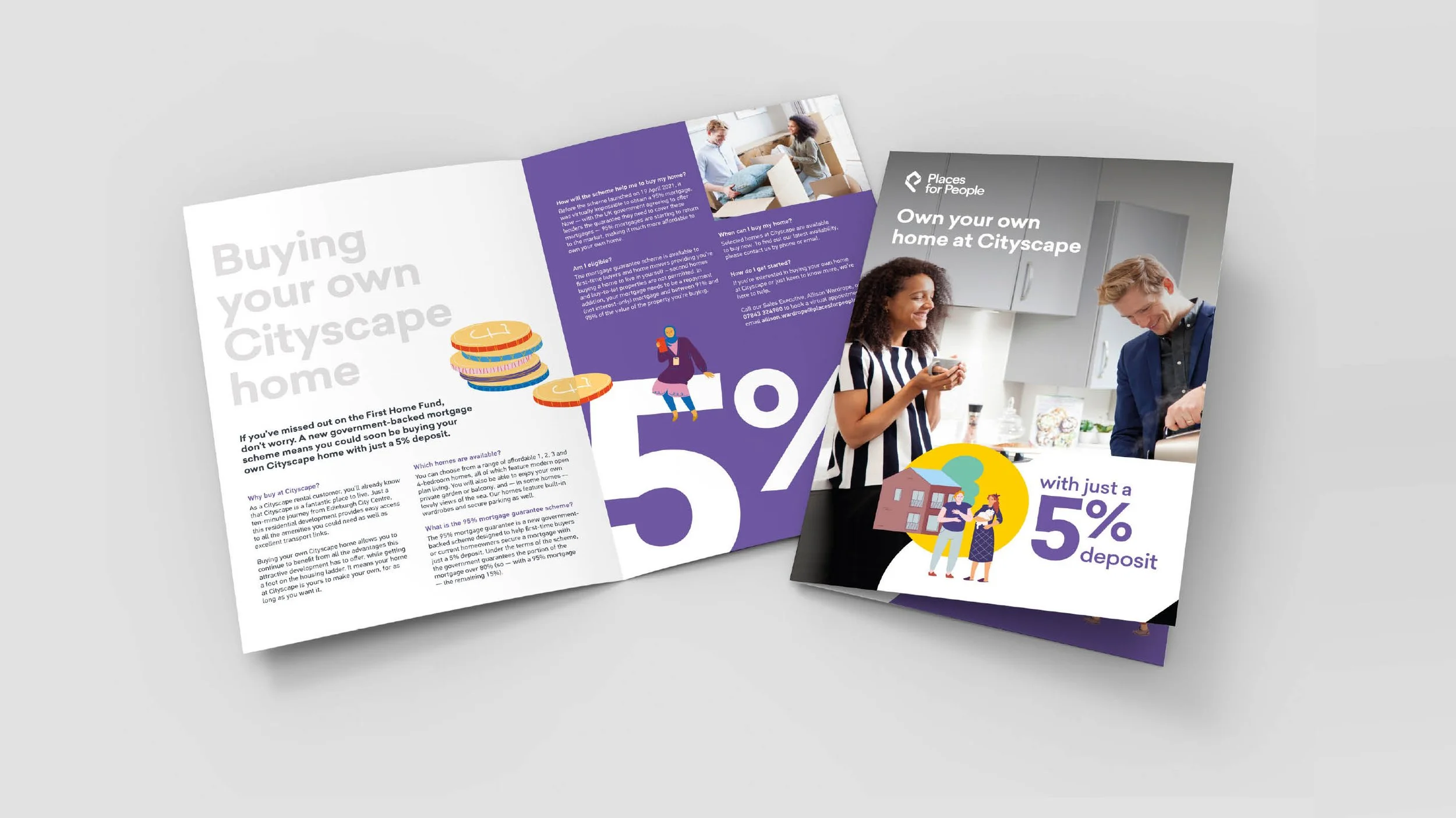
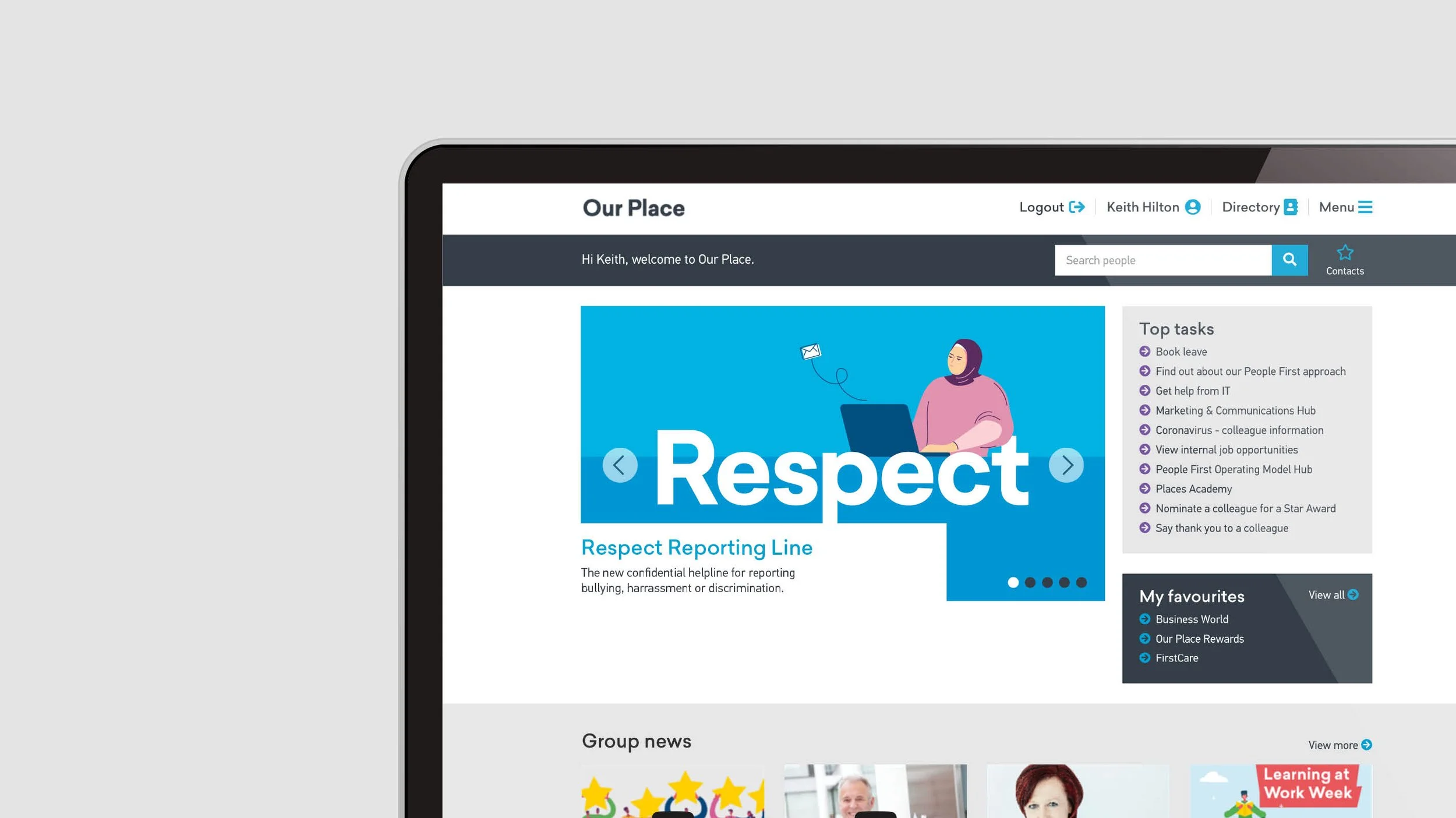
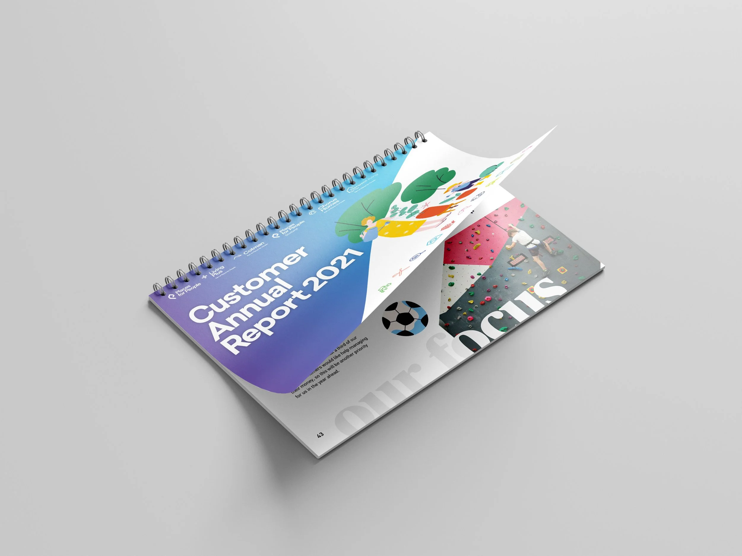
To enhance our efforts, we commission illustrations by Rosa Mella that accurately represented the diversity of our colleagues and customers, showcasing them participating in a range of authentic activities. The illustrations enabled us to create more vibrant and playful communications and helped ‘soften’ our brand. Communications were well received with positive feedback from customer focus groups and colleague forums. The team received a number of employer brand awards for the #together internal campaign that supported colleagues through the pandemic and which utilised the People First aesthetic.