ProAce Sports
Brand identity.
Problem
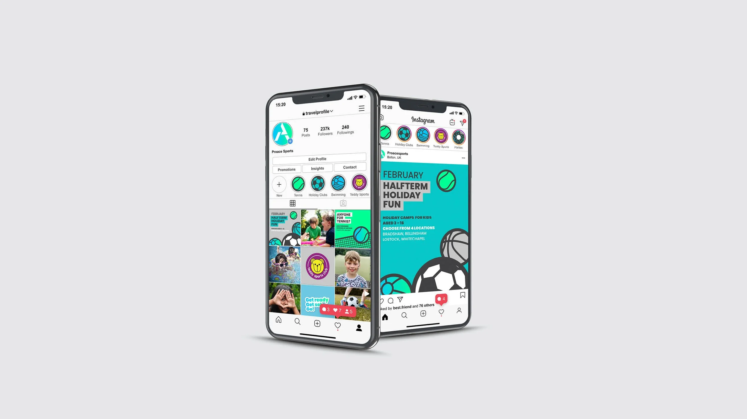
The aim was to establish an overarching brand that encompassed other brands, and which represented a wide range of multi-sport activities, including tennis, swimming, and franchises. This overarching brand was intended to target B2B stakeholders, such as schools and sports providers, while also having the flexibility to appeal to employees and parents of children participating in these activities.
Solution
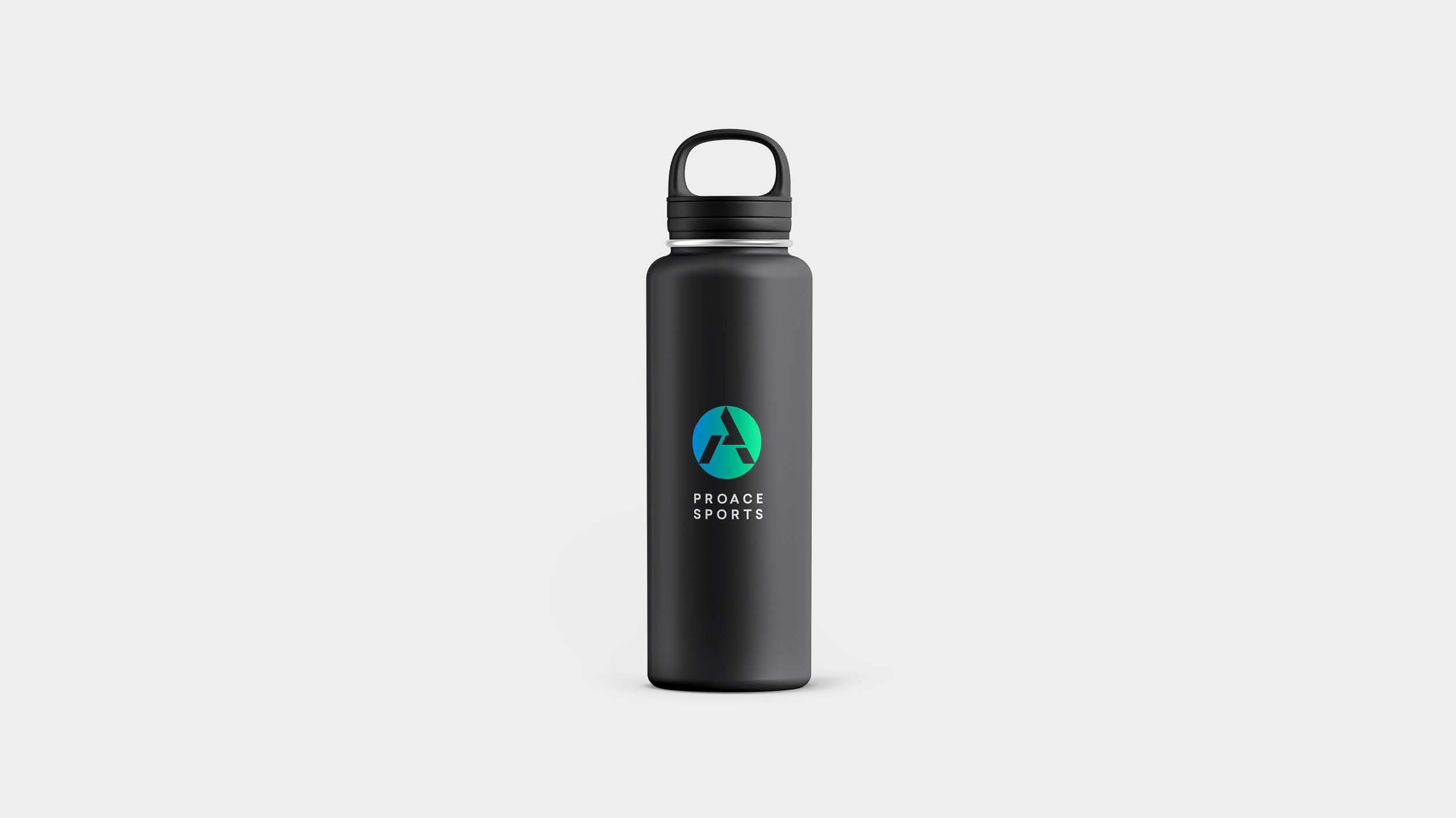
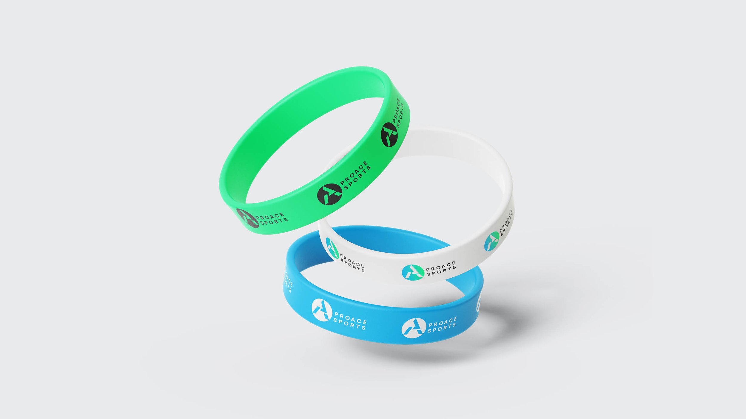
A unique logo was designed by combining the letters P and A, which was complemented by a vibrant gradient colour palette to reflect the dynamic and energetic nature of sports activities. Additionally, a visual language was developed that incorporated sports-related phrases and assigned specific colours to each area of the business, ensuring clear and effective signposting.